How to choose a perfect color for your brand?
What color should I paint my office?
What colors should I use on my website?
What color would best get the attention of my customers?
What color makes my workers more productive?
You must be a businessman since this article grabbed your attention. A wise businessman knows how to use color to their advantage. Your brand color will be applied to your site, logo, social profile, and any other collateral that you’re creating. Customers tend to listen to your colors rather than what your text is saying. There are four important things that you need to bear in mind.
1- Work on the perception of temperature.
Colors are divided into two main categories: Warm and cool. Warm colors provoke energy. Cool colors are associated with calmness and security. If you live in a cold environment, warm colors on your walls and doors make people in your workplace feel better. For a warm environment, it goes the other way around.
2- Work on emotional responses
Colors have universal effects on humans, for instance, yellow makes everyone energetic. Also, a person's experience can affect feelings about a certain color. A shade of red may remind a kid of bitter medicine.
3- Use colors to reflect your brand
colors represent your brand, even when they don’t involve any text on them. Use unique colors to increase your brand recognition. Also, use colors that will highlight your brand strength.
4- Right colors increase your sell
Affect purchasing decisions. A product’s color influences 60-80 percent of a customer’s purchasing decision. Especially if you offer financial services, you must use persuasive color tones.
Green Sparks Creativity
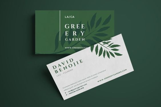
Green is associated with broader thinking and more creative thoughts. You can place some plants around your employees to make them more productive. Green is synonymous with calmness, safety, generosity, and freshness.
Color codes: Health, wealth, prestige, serenity, generosity, safety
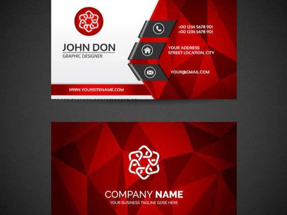
Red increases passion and reduces analytical thinking.
Red is used in 29 Brands out of the world’s top 100 brands. Red evokes a passionate and visceral response. You can design the buttons on your website in red because red is attention-grabbing. Red increases your heart rate and makes your breath faster, which helps make reactions fast and more forceful. It isn’t helpful if you need your workers to stay on task. Athletes are more likely to lose when their opponent is wearing red. Red sports cars cost more to insure. Coke is an energizer that triggers your feelings. Red also represents danger. Don’t wear red clothes when interviewing a job seeker.
Color code: Aggressive, energetic, provocative, danger, attention-grabbing, passionate, distracter.
Blue is everyone’s favorite.
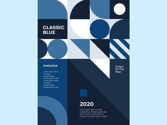
A clear blue sky or a calm sea is a good sign. Using blue in any place can satisfy the majority of people. Blue can comfort those in distress and put people at ease. 33 brands out of the world’s top 100 brands use blue in their logo and business. Blue is associated with Trust, security, and confidence.
color code: Trustworthy, dependable, secure, responsible, confident
Yellow is not well-liked.
Yellow evokes a feeling of positivity in brand identity. It is associated with the sun, which brings out hope and optimism. If you want to generate a positive response, yellow would be a perfect choice. 13 brands out of the world’s top 100 brands use yellow. Yellow is the least likely favorite color for most people. If you want to appeal to the masses, Yellow would not serve your brand. Although, yellow is the color that is easiest to spot from a distance at night. If you want to draw the attention of your audience to a spot on a dark texture, use yellow.
Color code: positivity, Playfulness, light, warmth, motivation, creativity, happiness.
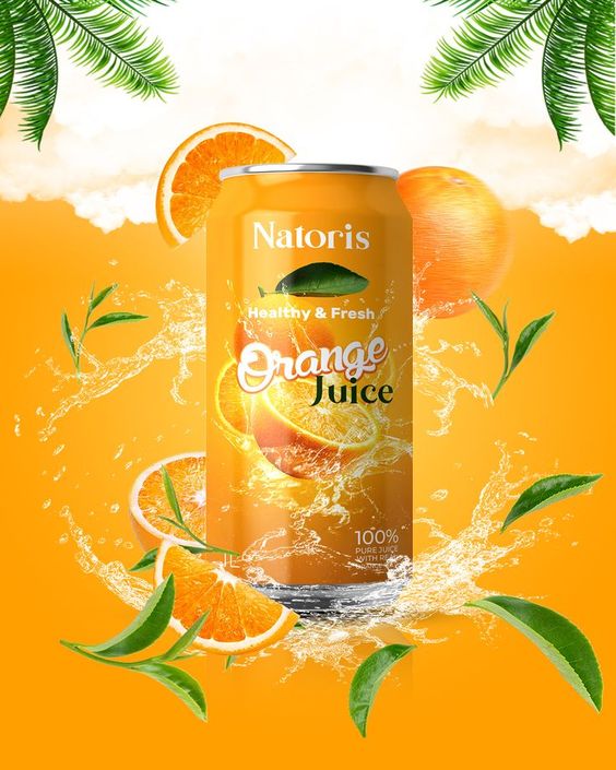
orange is used on valuable goods.
Orange is full of vitality. Orange blends the optimism and the brightness of yellow and the passion and the energy of red. Orange helps customers view a brand as a low-cost provider of valuable goods. Orange may serve a retailer to make a good first impression. It is a creative cheerful color that evokes a friendly and adventurous feeling.
Color code: vitality, fun, playful, exuberant, outgoing
Pink calms people down
Doctors should take this color seriously. It helps patients to feel less pain. As a manager, consider using pink in the boardroom to keep the conversations from getting heated. Sometimes pink evokes feminine energy depending on what it is used on.
Brown is so earthly
Brown reflects the color of the earth. Earth is strong and stable. It makes your brand feel natural. Brands that want to create a feeling of comfort use this color. It also conveys a down-to-earth and honest appeal.
Color code: earth-like, organic, natural, honest simplistic, durable, comforting
White has a modern appeal
White is simple but modern, clean and pure, but Sometimes it also may lead to boredom. It’s better not to use white monochromatically. Pure white makes people reflect on their thoughts. They may be distracted from the task at hand, and their mind begins to wander because of a lack of stimulation.
Color mode: pure, noble, innocent. clean, soft, minimalistic
Black is classic and sophisticated
Black is the most classic option for brands. It helps a brand identity to stand out. It can represent the feeling of power and luxury at the same time. Whenever you want to create stronger emotions, combine black with other colors, without losing the classical appeal.
Color code: Prestige, value, timelessness, sophistication, power
Investigate what colors your competitors are using. Your color pallet should be different than theirs if you want to come across as unique. Have a brand story for the colors that you use. So be picky, choose wisely, and be stylish.
